Action Games
 Racing Games
 Shooting Games
 Arcade Games
 Puzzle Games
 Strategy Games
 Multiplayer Games
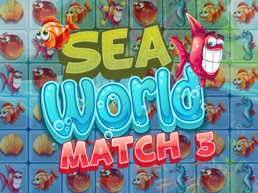
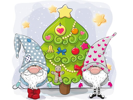
Sea World Match 3
Best Games
More Best Games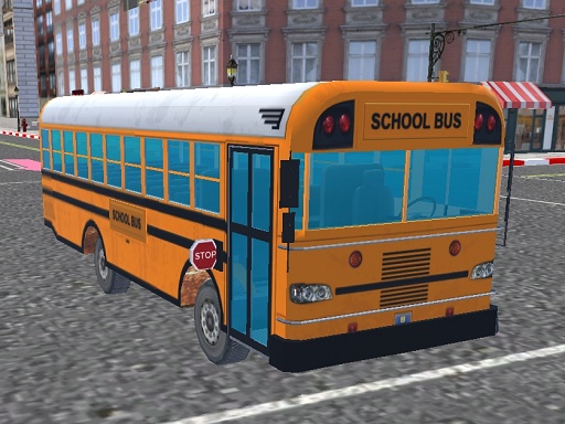
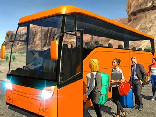
Bus School Park Driver

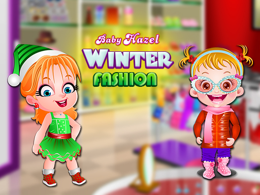
Ice Queen Salon - Frozen Beauty
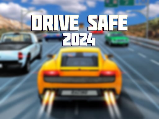
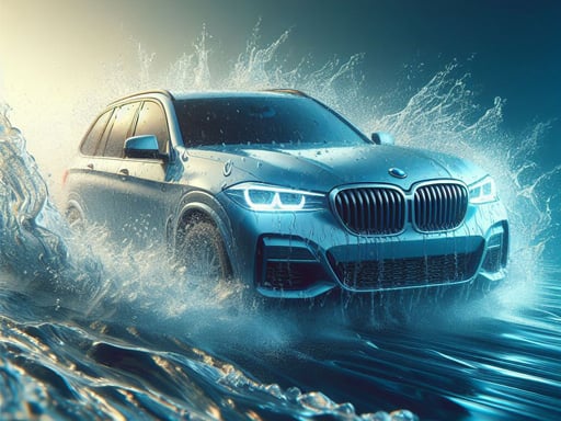
2D Car Driving: Drive Safe
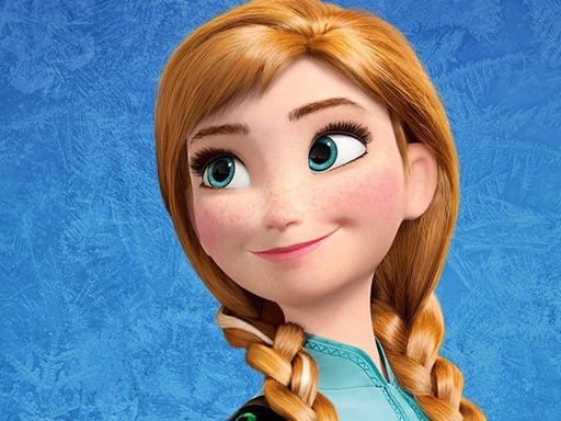
Anna Frozen Jigsaw Puzzle Collection
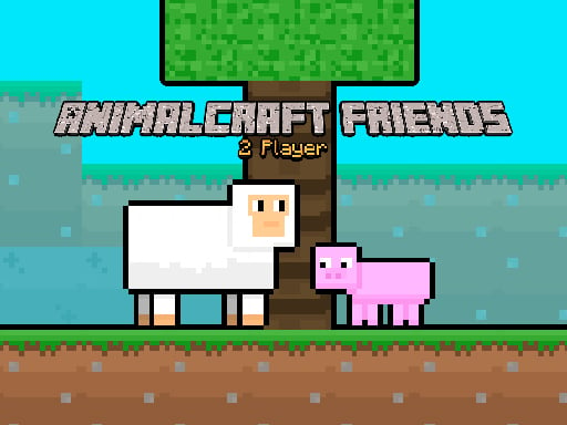
AnimalCraft Friends
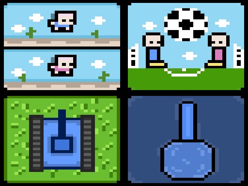
4 Games For 2 Players
Pixel Zombie Suvival Toonfare
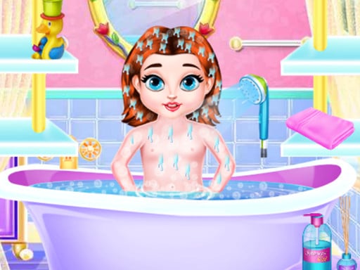
Baby Taylor Daily Caring
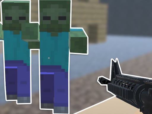
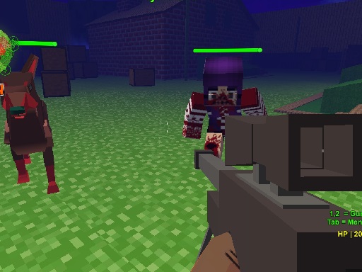
Steve Zombie Shooter
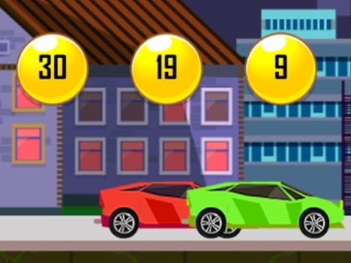
Speedy Race Math
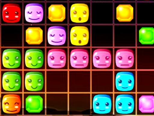
1010 Diamonds Rush
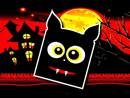
Halloween Geometry Dash
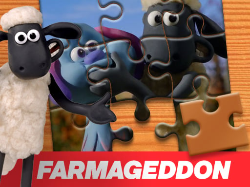
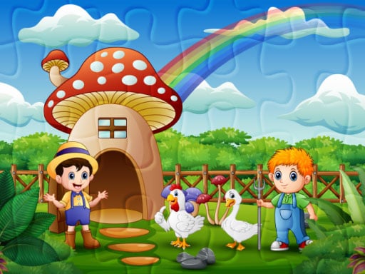
A Shaun the Sheep Movie Farmageddon Jigsaw Puzzle
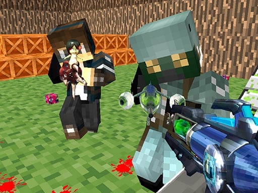
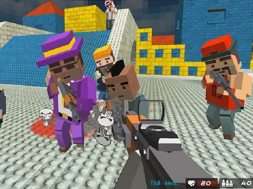
Blocky Gun Paintball
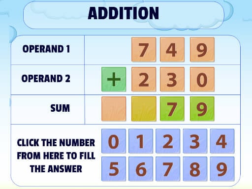
Addition Practice
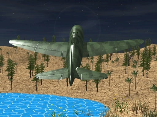
Advanced Air Combat Simulator
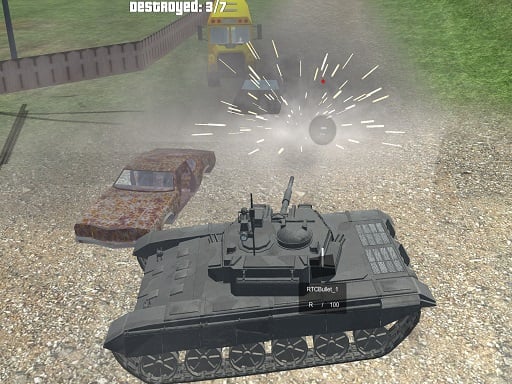
Tank Shooting Simulator
Physics Puzzle
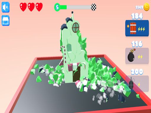
Town Destroy
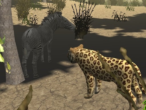
African Cheetah Hunting Simulator
Racing Games
More Racing Games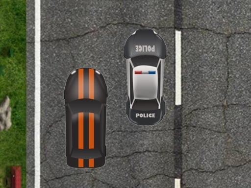
Highway Police Race
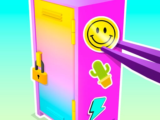
DIY Locker

Christmas Girl Dressup

Celebrity Fashion Battle
Stop Them All
Graffiti Pinball
Sky Parking - Car Parking
Squid Gamer BMX Freestyle
Car ZigZag 3D
Bus Parking Adventure 2020
Indian Truck Driver Cargo Duty Delivery
Mega Ramp Car Stunt Race
Public Transport Simulator 2021

Color Maze Puzzle - Fun & Run 3D Game

Coco Jigsaw
TomatoRunner
Speedy Race Math
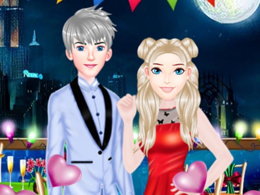
The Boyfriend Of Valentines Day
Water City Racers
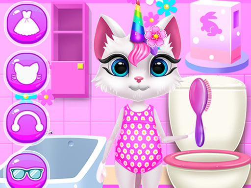
Kitty Unicorn Daily Care
Shooting Games
More Shooting Games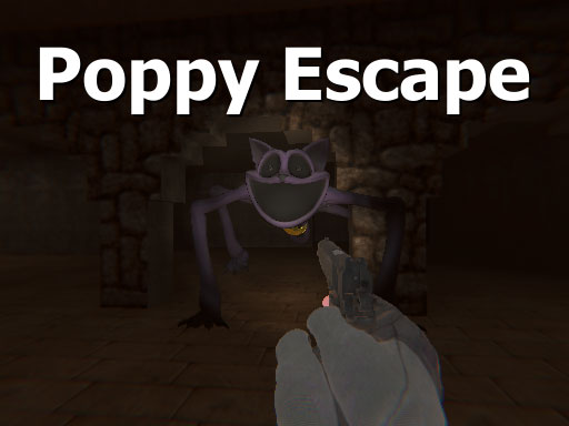
Poppy Escape
Doomsday Survival Rpg Shooter
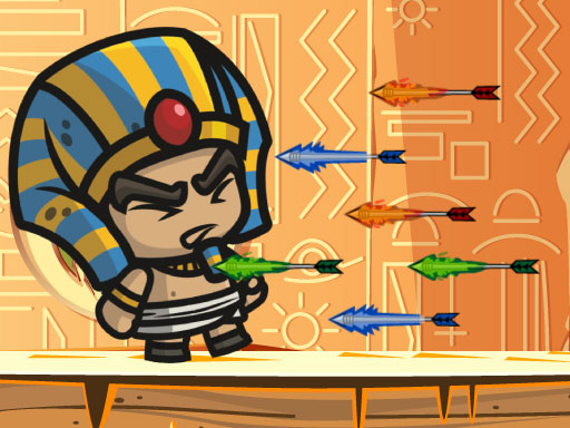
Adventure of Egypt
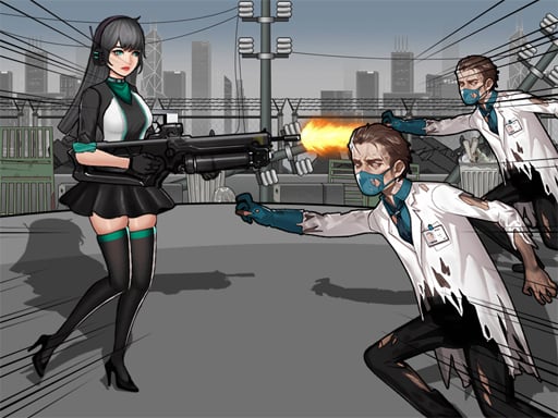
Blocky Gangster Warfare 2022
Cannon Bounce 3D
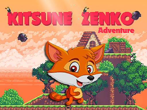
Super Kitsune Zenko
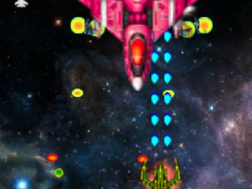
Xtreme Space Shooter
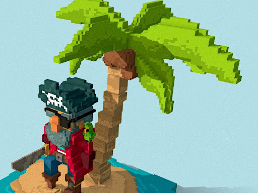
Pirates of Voxel
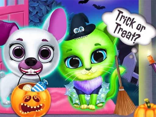
Scary Makeover Halloween Pet Salon
Professor Bubble
Robot Assembly
Trucks and Digger Jigsaw
volumetric wood
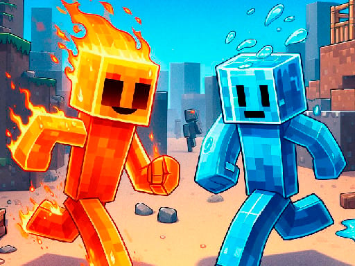
Fire and Water Stickman
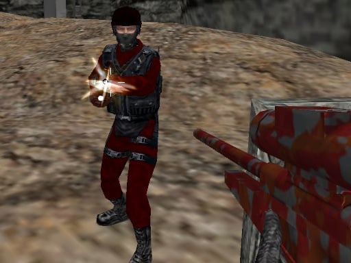
CS Online
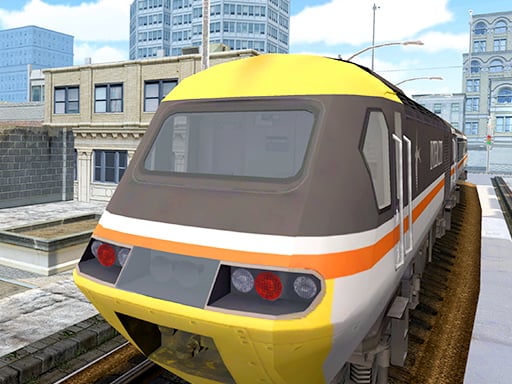
TRAIN GAME IO
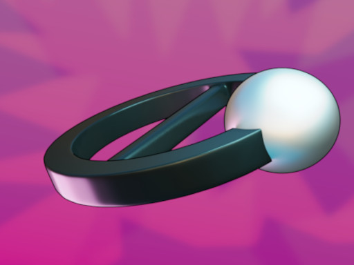
Cerkio
1010 Diamonds Rush
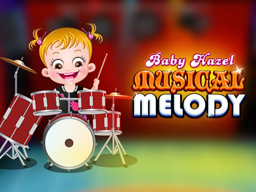
Baby Hazel Musical Melody
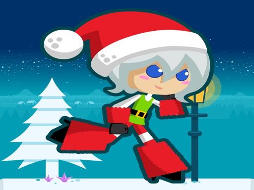
Santa Girl runner
Puzzle Games
More Puzzle Games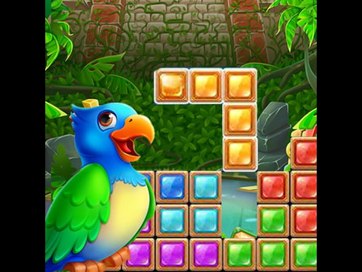
Jungle Puzzle
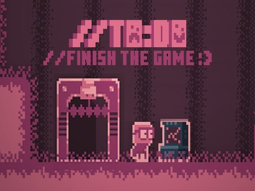
TO DO Finish the game

Idle Casino Manager Tycoon
Mahjong Fish World
American Football Girl
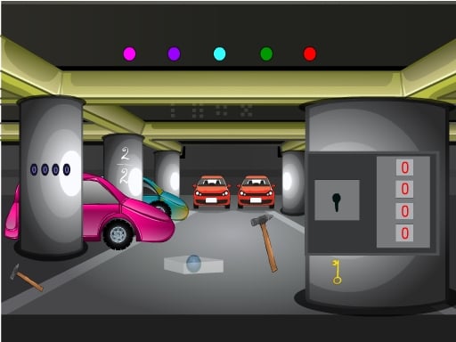
Escaping the Prison
Cool Boy Dress up
Valentines School Bus 3D Parking
Stickman Prison Warriors
Sunny Bunnies Jigsaw Puzzle
Bottle Flip Era: Jeu 3D
Amgel Easter Room Escape 3
Magical Unicorn Pet Care
Plumber & Pipes

Sweet Plush
Pet Haircut Beauty Salon - Animal Hair Salon
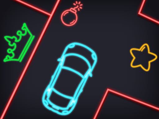
Neon Car Puzzle
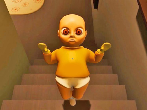
Baby in Yellow
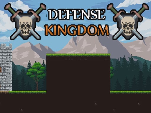
Defense Kingdom
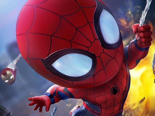
Super Spiderman